palette
A still colour-palette image with labelled, auto-contrasting swatches.
palette renders a still PNG of colour swatches. Each swatch is labelled with the fields you place
in its corners (name / hex / rgb / oklch / hsl), and the label text auto-contrasts against
the swatch behind it. It's a local generator — no url, no browser navigation — so only colors
is required.
{
  name: "brand-colors",
  generator: "palette",
  options: {
    colors: [
      { name: "Ink", hex: "#1a1714" },
      { name: "Camel", hex: "#b49a77" },
      { name: "Paper", hex: "#f6f3ed" },
    ],
  },
}
By default it lays the colours out as full-width rows, labelling each with its name + hex (top-left)
and rgb + oklch (top-right). The options switch the layout to columns or a grid, choose which fields
land in which corner and how they're formatted, embed a brand font, and tune sizing, contrast, and
spacing.
Config options
Only colors is required. Reference is the interactive view; TypeScript is the same shape in
code, every option at its default.
colors{ name, hex }[]required
The colours to show — at least one. Each swatch is rendered in listed order.
namestringrequiredDisplay name, e.g. "Wet Grey".
hexstringrequiredHex value — "#rgb" or "#rrggbb", with or without the leading #.
outputobject
Output image sizing and filename.
widthnumberdefault 1400Output width in px.
heightnumberdefault 1750Output height in px (portrait 4:5 with the default width).
deviceScaleFactornumberdefault 2Render scale, max 4 (2 = retina-crisp).
fileNamestringOutput filename. Defaults to "<slug(asset name)>.png".
layoutobject
Swatch arrangement and spacing.
layout'rows' | 'columns' | 'grid'default 'rows'Swatch arrangement: full-width bands, full-height columns, or an N-wide grid.
gridColumnsnumberdefault 3Columns when layout is "grid" (1–12).
backgroundstringdefault '#ffffff'Page background, shown only in the gaps between swatches.
gapnumberdefault 0Gap between swatches (px). 0 makes the swatches abut.
cornerRadiusnumberdefault 0Swatch corner radius (px). 0 is square.
paddingnumberInset of the labels from the swatch edges (px). Omit to derive from the width.
fieldsobject
Which fields land in which swatch corner.
topLeftFieldId[]default ['name', 'hex']Fields stacked (top→bottom) in the top-left corner.
topRightFieldId[]default ['rgb', 'oklch']Fields stacked (top→bottom) in the top-right corner.
bottomLeftFieldId[]default []Fields stacked (top→bottom) in the bottom-left corner. Empty by default.
bottomRightFieldId[]default []Fields stacked (top→bottom) in the bottom-right corner. Empty by default.
textobject
Label text styling and formatting.
uppercasebooleandefault falseUppercase the colour names.
rgbStyle'labeled' | 'css' | 'plain'default 'labeled'RGB string style — "R:255,G:128,B:0", "rgb(255, 128, 0)", or "255 128 0".
oklchStyle'css' | 'labeled'default 'css'OKLCH string style — "oklch(88% 0.012 250)" or "L:88% C:0.012 H:250".
fontFilestringCustom font file (.woff2 / .woff / .ttf / .otf) embedded into the render. Omit to fall back to a system bold sans.
fontSizenumberLabel font size in px. Omit to derive from the width.
fontWeightnumberdefault 700Label font weight (1–1000).
contrastobject
Auto-contrasting text colours and threshold.
textLightstringdefault '#ffffff'Light text colour, used on dark swatches (picked by contrast).
textDarkstringdefault '#141414'Dark text colour, used on light swatches (picked by contrast).
contrastThresholdnumberdefault 0.5Luminance (0–1) above which the dark text colour is used.
{
  name: "brand-colors",
  generator: "palette",
  options: {
    // --- content (required) ---
    colors: [{ name: "Ink", hex: "#1a1714" }],

    // --- output image sizing & filename ---
    output: {
      width: 1400,
      height: 1750,
      deviceScaleFactor: 2,
      // fileName: "brand-colors.png",        // optional; defaults to <slug(name)>.png
    },

    // --- swatch arrangement & spacing ---
    layout: {
      layout: "rows",
      gridColumns: 3,
      background: "#ffffff",
      gap: 0,
      cornerRadius: 0,
      // padding: 40,                          // optional; derived from width
    },

    // --- corner fields (each stacks its list top→bottom) ---
    fields: {
      topLeft: ["name", "hex"],
      topRight: ["rgb", "oklch"],
      bottomLeft: [],
      bottomRight: [],
    },

    // --- label text styling & formatting ---
    text: {
      uppercase: false,
      rgbStyle: "labeled",
      oklchStyle: "css",
      // fontFile: "public/fonts/Inter.woff2", // optional; embeds your brand font
      // fontSize: 48,                          // optional; derived from width
      fontWeight: 700,
    },

    // --- auto-contrasting text colours ---
    contrast: {
      textLight: "#ffffff",
      textDark: "#141414",
      contrastThreshold: 0.5,
    },
  },
}
The available corner field ids are name, hex, rgb, oklch, and hsl. How each renders:
| Field | Style | Example |
|---|---|---|
hex | — | #FF8000 (always uppercased) |
rgb | "labeled" | R:255,G:128,B:0 |
rgb | "css" | rgb(255, 128, 0) |
rgb | "plain" | 255 128 0 |
oklch | "css" | oklch(88% 0.012 250) |
oklch | "labeled" | L:88% C:0.012 H:250 |
hsl | — | H:210,S:14,L:88 (s/l are percentages) |
Examples
Default rows
Pass colors and nothing else — full-width bands, each labelled with auto-contrasting text.
{name: "colors",generator: "palette",options: { colors: [ { name: "Ink", hex: "#1a1714" }, { name: "Paper", hex: "#f6f3ed" }, { name: "Camel", hex: "#b49a77" }, { name: "Loden", hex: "#5c5e4c" }, { name: "Cognac", hex: "#8a5a3c" }, ],},}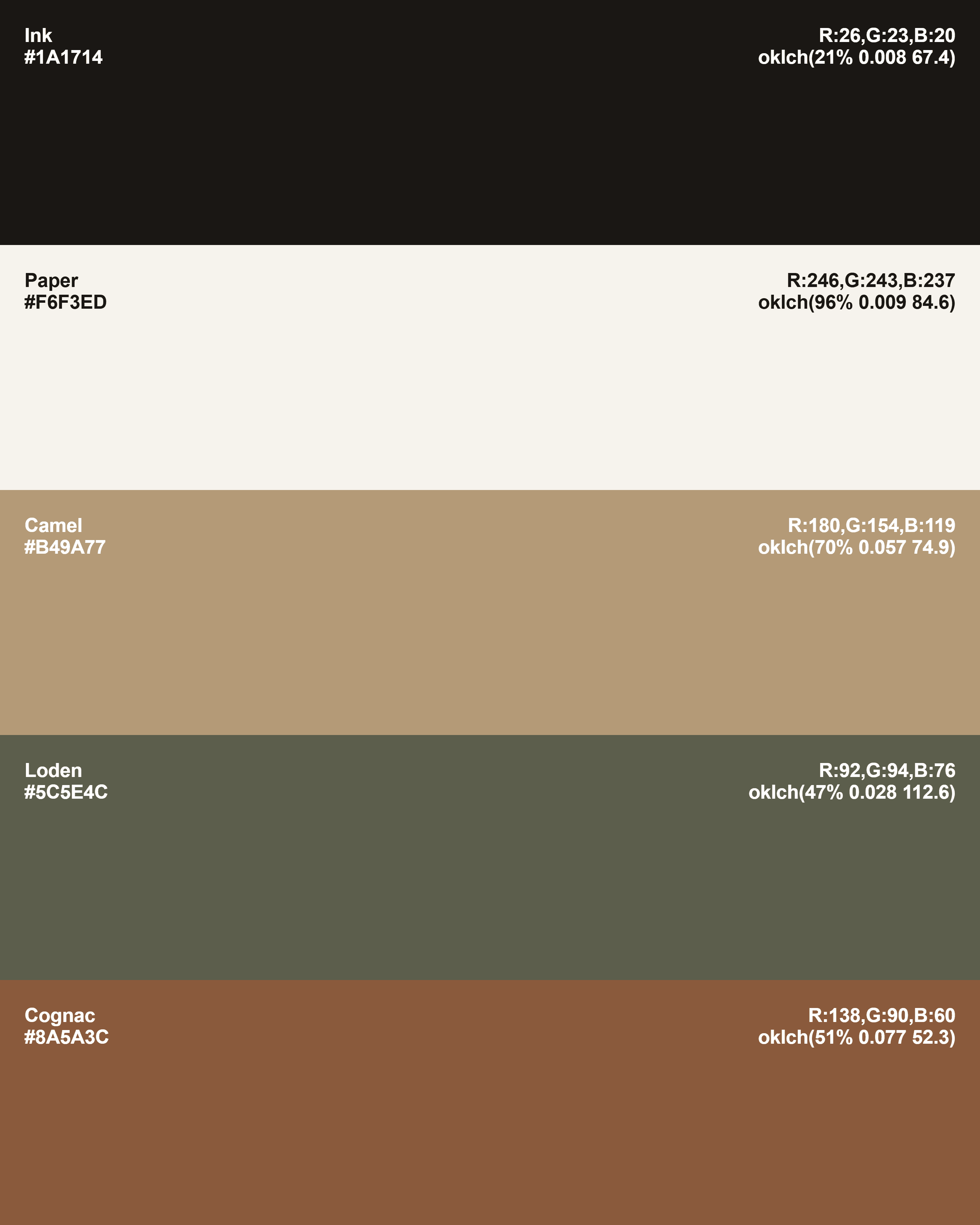
Grid with placed corners
Switch to a grid and choose exactly which field lands in each corner, then embed a brand font.
{name: "brand-colors",generator: "palette",options: { colors: [ { name: "Ink", hex: "#1a1714" }, { name: "Camel", hex: "#b49a77" }, { name: "Paper", hex: "#f6f3ed" }, { name: "Loden", hex: "#5c5e4c" }, ], layout: { layout: "grid", gridColumns: 2, }, fields: { topLeft: ["name"], topRight: ["hex"], bottomLeft: ["rgb"], bottomRight: ["oklch"], }, text: { // rgb(26, 23, 20) rgbStyle: "css", // embeds your brand font fontFile: "public/fonts/Inter.woff2", uppercase: true, },},}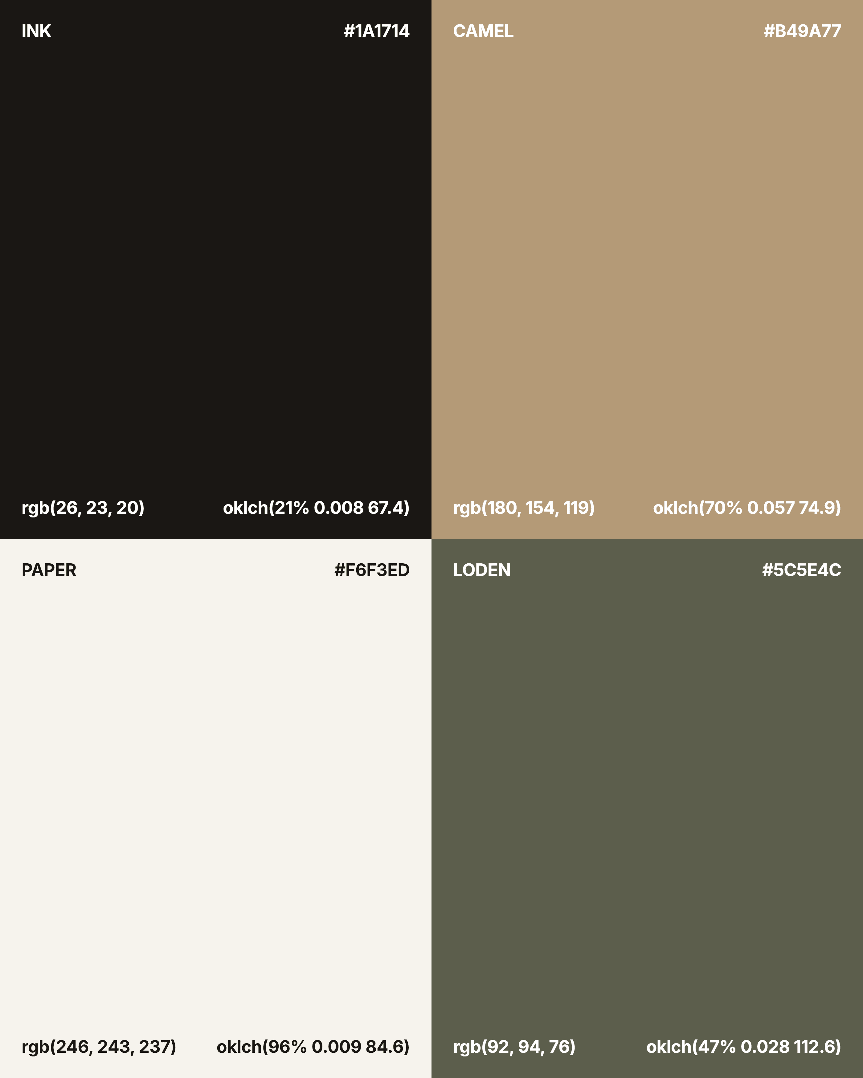
For a moving version, see palette-reel.